
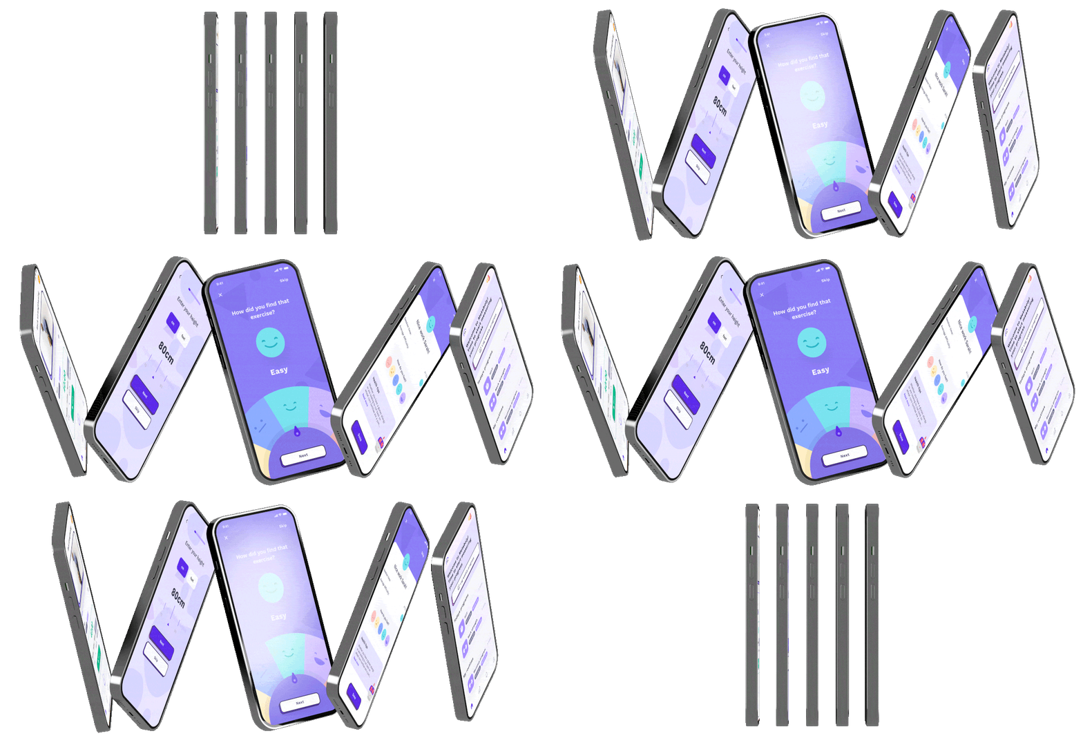
Exercise physiologists had no software. We built it.
EPs prescribe exercise as medicine for people managing chronic conditions, post-surgery recovery, and metabolic disease. They're the fastest growing allied health profession, and they were running their entire practice through spreadsheets, WhatsApp, and generic booking tools.
Metaboly was a two-sided SaaS platform: a web app for clinicians to manage programs and track patients, and a mobile app for patients to follow their prescribed exercise and stay accountable between sessions. The core bet was that the gap between clinical appointments was where outcomes were won or lost.
We were backed by Incubate, NSW Government, The Australian Catholic University, The Pearcy Institute, SmartCompany and the University of Sydney. By the time I closed the company in 2024, the platform was being used by clinic networks across Australia.
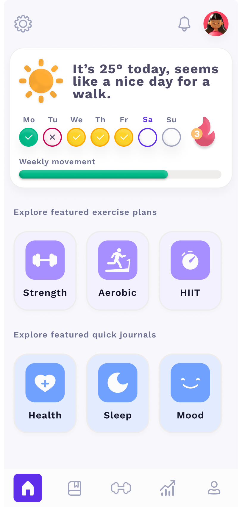
Two buyers. Very different problems.
Metaboly served exercise physiologists at varied levels. We had two distinct buyer profiles with nuacnced differences in motivations, pain points, decision levers, and different willingness to adopt new software.
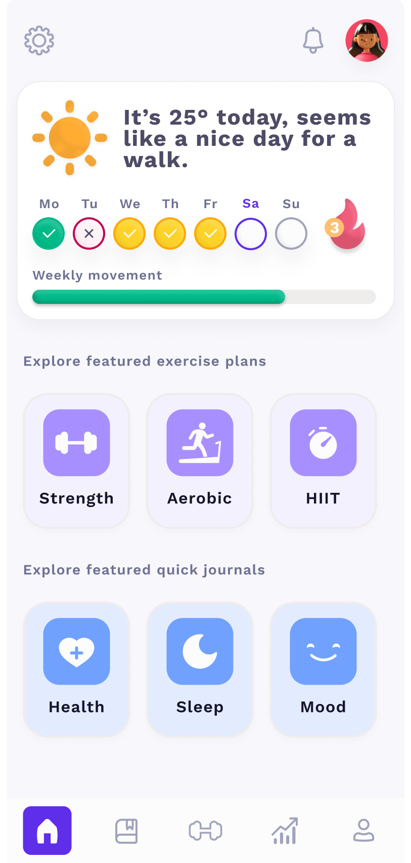
Neither group was particularly tech-savvy. EPs are clinicians first, they chose their career to work with people, not software. Their patients are often older adults managing chronic conditions, many of whom found clinical-looking interfaces cold, intimidating and hard to use. I designed Metaboly to be the opposite: as friendly, usable, and accessible as possible. That sometimes meant larger touch targets than convention would suggest, deliberately constrained layouts that removed the anxiety of choice, and a visual language that felt closer to a friendly consumer health app than a practice management tool. Accessibility wasn't there for compliance, it was essential to adoption.
- Buyer is also the user
- Sees 15–20 clients per week
- Overwhelmed by admin and chasing up clients
- Operations largely manual
- Desperate to keep clients on the books
- Employs ~5 clinicians, still seeing clients
- Clinic sees 150 clients per week
- Performance driven, looking to optimise
- Using several platforms to run the clinic
- High overheads, wants retention metrics
Solo designer. Lead founder. Responsible for everything visible.
I designed Metaboly from scratch: problem scoping, solution ideation, product strategy, UX research, information architecture, UI design, the design system, brand identity, marketing, and go-to-market materials. And honestly that was barely half my tasks as founder. I designed two products (web and mobile app) entirely from scratch, both unprecedented so there was no blueprint, for two famously difficult to design and market for user groups (healthcare professionals and the chronically ill middle-aged to elderly).
I worked directly with engineers in tight weekly loops: design Monday, build Tuesday–Thursday, ship Friday, real-EP feedback by the following Monday. Handoff was more of an on-going loop, day-in-day-out. I learned to pivot designs around a constraint quickly, whether that was a technical limitation with our Elastic Transcoder, or the realisation that our measurements could unknowingly expound an eating disorder.
I ran the user research. I recruited exercise physiologists, observed clinic sessions, and tested prototypes with real patients. The product decisions that mattered most came from watching how they behaved, and rarely what they actually said. We learned early on that if we build what they're begging for, half the time they didn't really need it and we'd burned a few weeks of runway.

I designed the Clinician platform to be fun, to look and behave like no other on the market, to set us apart from ill-fitting the clinical measurement tools.
Patients get better in the clinic. They lose the gains at home.
Exercise physiology has an adherence problem that the industry treats as a patient character flaw. My key insight and what my TEDx talk was about is that it isn't. After speaking to my co-founder (an industry leading academic in the field) I realised it wasn't a problem with patient behaviour, it was a design problem with the systems they were using.
EPs prescribe a program. Patients follow it for a few weeks, get busy, lose the habit. The clinician has no visibility into what's happening between sessions. No signal means no ability to intervene before the patient churns. By the time the EP knows there's a problem, the patient has already left.
The gap between appointments was invisible. That invisibility was the product opportunity.
Existing tools offered two inadequate answers: replace your entire practice management setup with something purpose-built (a huge ask for any solo EP or small clinic), or ignore the problem entirely. Neither was working. Adherence rates for exercise-based lifestyle treatment sat below 30% at 12 months.
The existing landscape
outdated paper model



aren't clinician-led
 headspace

Two platforms. One job: close the gap between sessions.
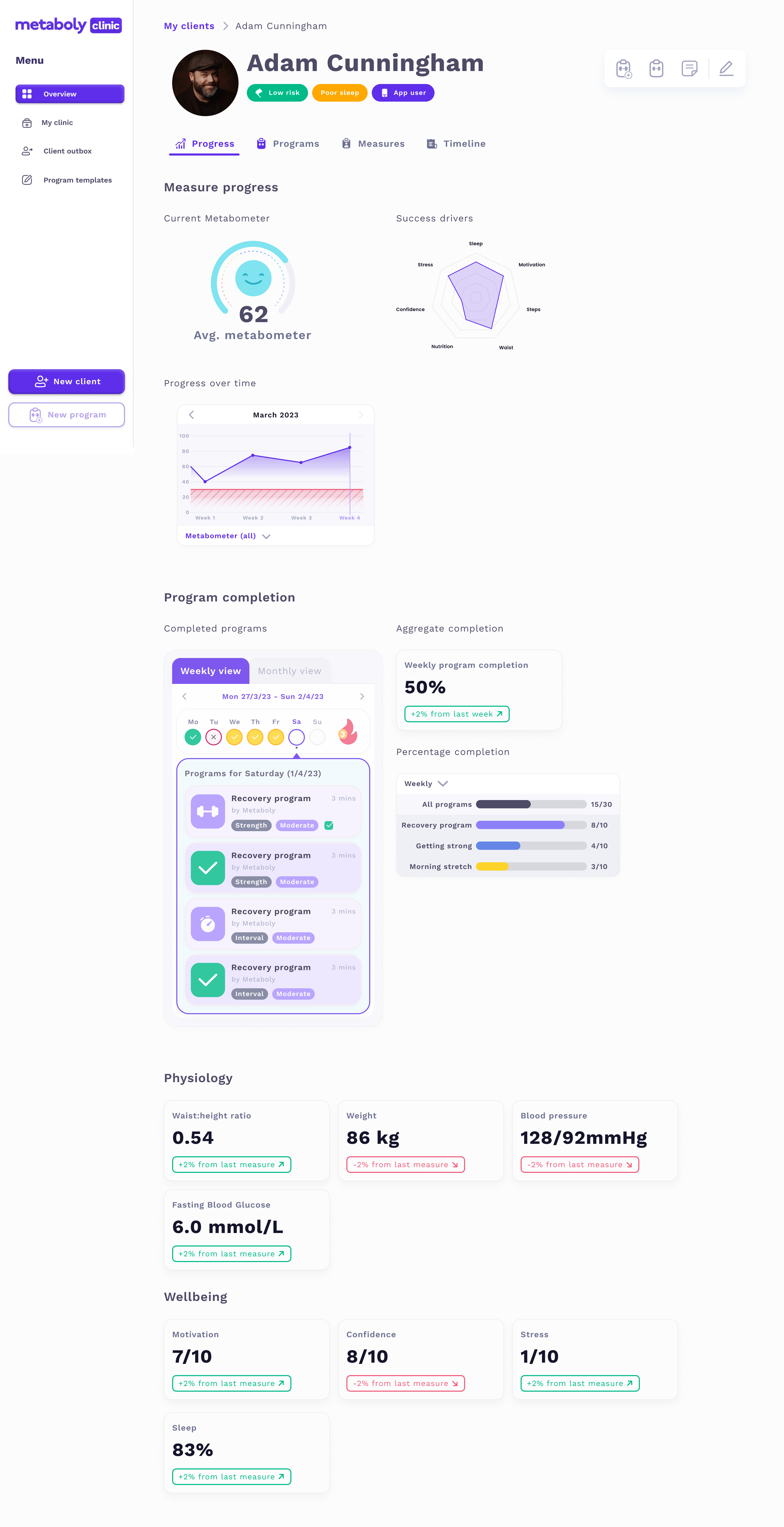
Metaboly Clinic was the clinician-facing web app. EPs built personalised exercise programs, assigned them to patients, tracked adherence in real time, flagged at-risk clients, and ran lightweight fortnightly check-ins, all inside the platform. The goal was to give the EP signal between sessions without adding significant work to their day.
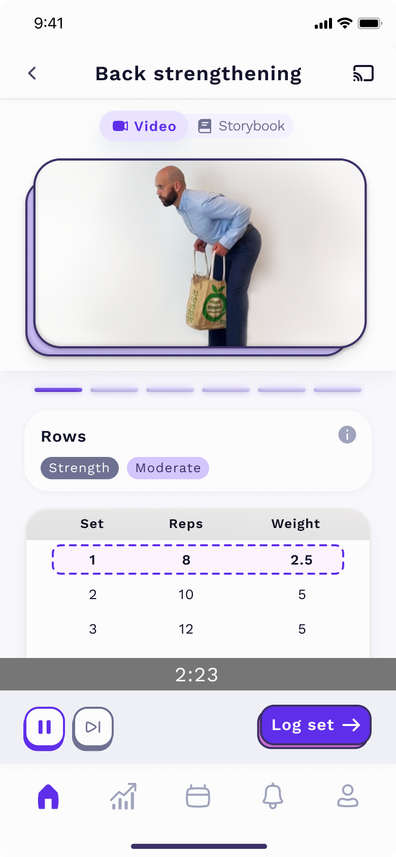
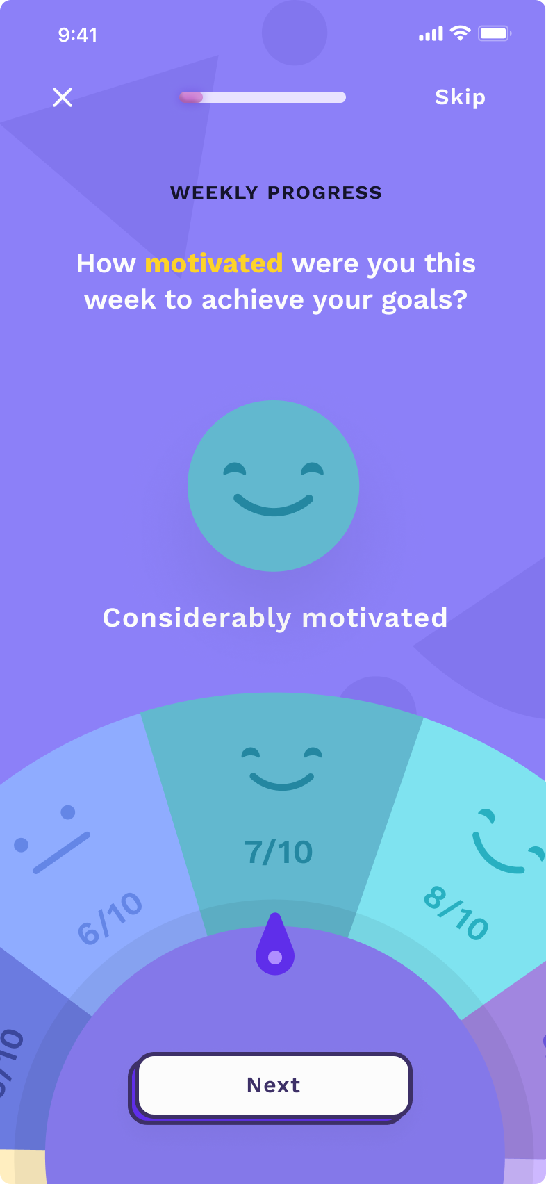
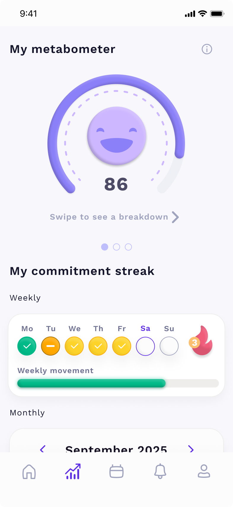
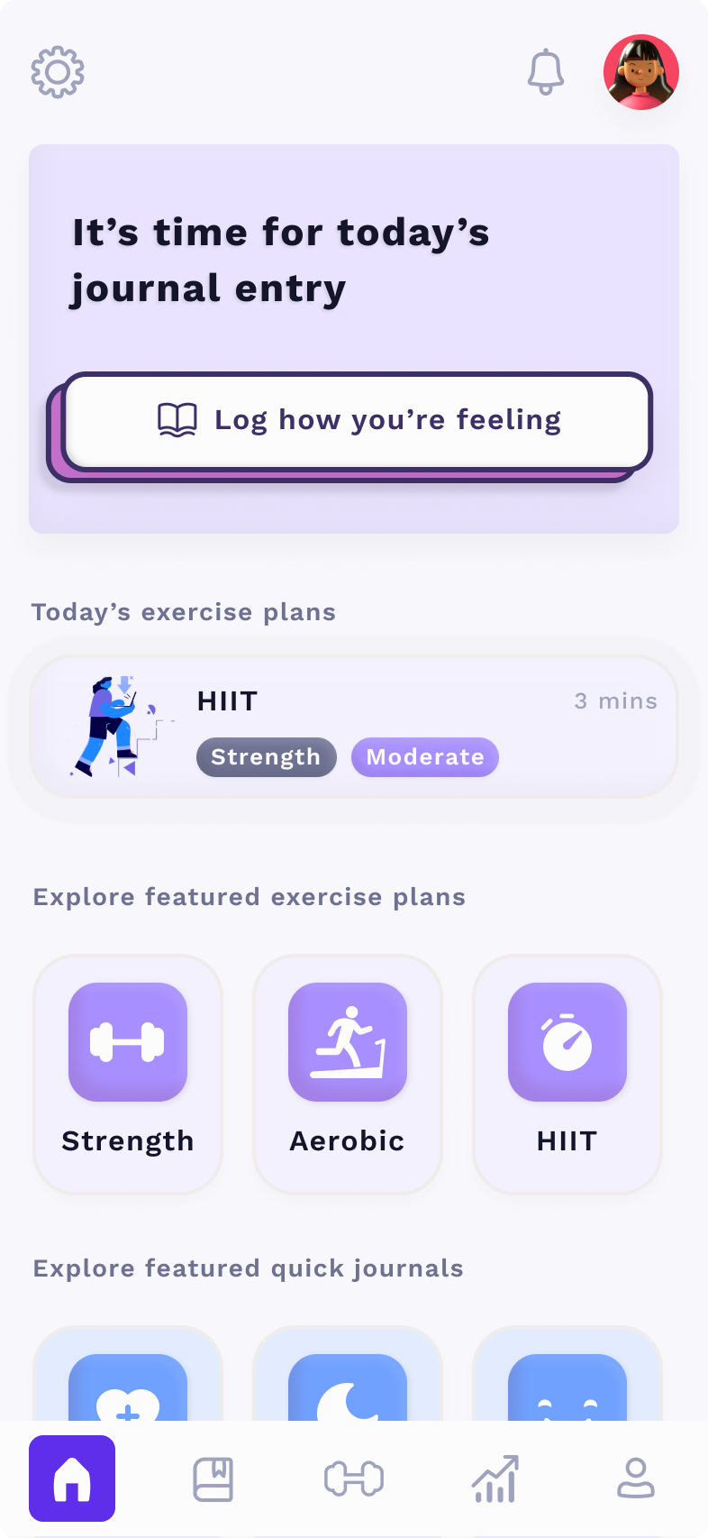
The patient app (iOS + Android) was where patients followed their program, logged sessions, answered weekly check-ins, and tracked their progress. The design centrepiece was the Metabometer, a single adherence score that distilled complex behavioural data into one number a patient could actually care about. It replaced a wall of metrics with something legible and motivating.
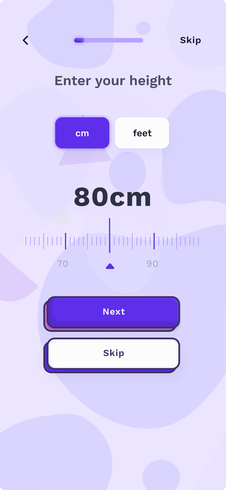
Onboarding was personalised, the app adapted based on the patient's goals, physical capacity, and motivation style. The experience was designed to feel like a health product, not a clinic admin tool.
We overbuilt, I killed two-thirds of our entire product, and it helped a lot.
The first version of Metaboly was a full practice management platform: booking, billing, healthcare integration, patient records, programs, and communications. It was well-designed. Clinicians loved the sessions. Unassisted adoption was close to zero.
EPs who had never used purpose-built software opened the app, saw the size of the migration required, and never came back. The problem wasn't the UI, it was the ask. We were telling a solo EP to switch their entire practice over to a product that had existed for six months.
I realised we'd let scope drift and it hurt our positioning. Practice management was a five-year fight against established incumbents. Adherence was an unsolved problem we could own now. So we stripped the product down to one job we knew nobody else was focusing on.
- /Removed the patient-records module. EPs already had one.
- /Removed billing.
- /Removed booking.
- /Removed patient comms.
- /Removed reporting.
- /Removed healthcare integration.
- /Kept the program builder, adherence tracking, and patient app.
- /Repositioned as an adherence addon — not a replacement for existing tools.
Perceived friction collapsed. Onboarding went from a multi-session migration to a single call. Adoption improved meaningfully.
Then we built the one thing nobody had built: a clinical flagging system.
With the product stripped back, we had space to make the adherence features genuinely powerful. The insight from churn research was clear: clinicians didn't need more data — they needed less, faster. A way to triage clients between sessions without adding work to their day.
We built a traffic-light flagging system (first of its kind) with two objectives:
- Give clinicians a digestible overview of client progress (or lack thereof)
- Make it easy to intervene quickly, but with depth when needed
- Gamified progression
- Easy compliance measures
- Weekly progress reports
- Custom prompts
- Accountability buddy
- All features +
- Manual prompts
- Prioritised visibility
- More regular check-ins
- All features +
- Highest priority visibility
- Phone call interventions
- Contact accountability buddy
How we helped patients
What changed empirically (MVP trial)
What changed for patients
The insight that drove the churn reduction wasn't a UI change, it was cadence. Fifteen-minute calls every fortnight outperformed hour-long monthly sessions on retention, with the same total contact time. A small change in shape produced a disproportionate change in behaviour. That's the kind of finding that only surfaces when you're watching real people use your product.
The bigger lesson: perceived friction determines adoption. Not actual friction - perceived. That's where drop-off lives, long before the user reaches the part of the product you instrument.
The full zero-to-one story.
The research, the define phase, the MVP trials, the pivots, and the build, documented as a micro case study along with more details on this pivot and others in the Approach section.
Zero to one — how I built Metaboly → Power to pivot — the feature creep and the fix →