Two pivots. Two approaches.
The two most notable points in my design career where I've needed to lead a pivot were at Metaboly and Baxta, as a Founder and a Senior designer. At Metaboly, we'd overbuilt a product nobody was ready to adopt - the fix was a radical reduction of scope and a repositioning of our UVP. Even if it meant taking away features that were fully built.
At Baxta, I inherited a pet-focused social app that had grown without a clear value proposition, the remedy was pivoting it into a marketplace with a coherent design system built around a validated, unified value proposition.
A two-sided SaaS platform for exercise physiologists. Built zero-to-one, then rebuilt because V1 lost sight of our UVP.
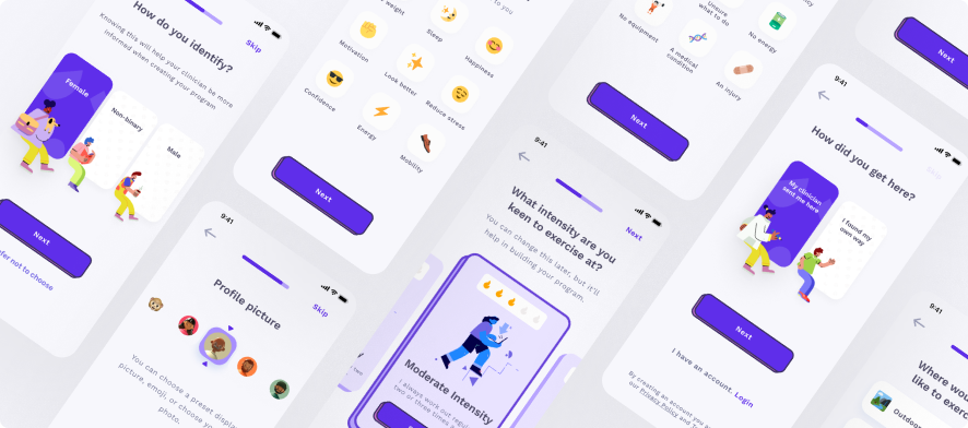
The mistake was obvious in hindsight, but not in a clinical environment.
Building Metaboly in a clinical health setting meant greater constraints than most products: a minimum floor of feature expectations, legal requirements, and a user base that was unusually vocal about what they said they needed. Clinicians would regularly tell us they categorically could not adopt a new platform unless it managed:
What clinicians asked for
- Client adherence tracking
- Client management
- Clinical measure onboarding
- Payments (Medicare, NDIS, WorkCover)
- Booking appointments
What we built for launch
- Adherence tracking + program creation
- Client management + measures
- Payments + reporting automation
- Calendar integration + virtual meetings
- Booking appointments + video consultations
Each of those features could have been its own SaaS product. At our stage, it should have been. We buried ourselves trying to nail every single one and produced a product that was functional, but not compelling. The worst outcome: it massively increased the perceived migration effort, which cut most potential conversations short.
Adoption was close to zero. The problem wasn't the UI.
The first version was well-designed. Clinicians liked the demo sessions. But EPs who had never used purpose-built software opened the app, saw the size of the migration required, and never came back. The problem wasn't the interface: it was the ask.
We were telling a solo clinician to switch their entire practice over to a product that had existed for six months.
I argued, with users and with the board, that we were solving the wrong problem first. Practice management was a five-year fight against established incumbents like Cliniko and Nookal. Adherence was genuinely unsolved. Nobody owned that gap. We could.
The fix: gut it. Rename what was left.
It was a simple but heartbreaking decision. We stripped the product to one job and rebranded this version Adherence+, keeping the original intact on a separate server for the handful of users still on it.
Just framing the platform as a lite adherence-focused add-on (before we'd removed a single feature) worked immediately. Perceived friction collapsed. Onboarding went from a multi-session migration effort to a single call. What we cut:
- Patient records module. EPs already had one.
- Billing and payments. Same reason.
- Booking and calendar integration.
What we kept: the program builder, adherence tracking, and patient app. Repositioned as an adherence addon, not a replacement for existing tools.
Then we built the one thing nobody had built: a clinical flagging system.
With the product stripped back, we had space to make the adherence features genuinely powerful. The insight from churn research was clear: clinicians didn't need more data: they needed less, faster. A way to triage clients between sessions without adding work to their day.
We built a traffic-light flagging system, the first of its kind in exercise physiology, with two objectives:
- Give clinicians a digestible overview of client progress (or lack thereof)
- Make it easy to intervene quickly, but with depth when needed
- Gamified progression
- Easy compliance measures
- Weekly progress reports
- Custom prompts
- Accountability buddy
- All features +
- Manual prompts
- Prioritised visibility
- More regular check-ins
- All features +
- Highest priority visibility
- Phone call interventions
- Contact accountability buddy
What changed.
The pattern: name it before you fix it.
The feature creep wasn't a UX failure. It was a strategy failure wearing a UX costume. The clinicians told us what they needed, but what they described was the pain of their current situation, not a product specification. Listening to users verbatim is dangerous. Listening to what they're actually afraid of is the job.
The thing they were afraid of was the migration. They dressed it up as feature requirements. Once we understood that, the solution was obvious: don't ask them to migrate. Slot in alongside what they already have.
What I'd do differently
I had the data I needed to pivot by month three. But I spent too long listening to what users said they wanted, rather than interpreting their actions and unifying around what makes us different. I was passionate about what we were solving for clinicians, so was my co-founder and so were the clinicians themselves. But I learned passion alone isn't enough — without urgency it is a hobby. Next time I'd compress that loop, pair conviction with the evidence to defend it on day one.
Baxta: a pet marketplace pivot
Baxta was originally conceived as a pet-focused social lifestyle app, taking advantage of the organic communities already living on Instagram and Facebook. By the time I joined as Senior Designer, the platform had been touched by 2-3 different agencies and had no clear value proposition, low usability standards, and a fragmented visual language with no alignment between design and engineering.
The decision
The social approach had no clear monetisation path and was failing to differentiate from the incumbents it was competing with. I advocated for pivoting the product toward a marketplace model, enabling pet businesses (breeders, boarders, trainers) to list services and transact directly with pet owners. After talking to users and running some white glove experiments I defined the listing card as the real user value and rebuilt everything else around it.
What was there
- 10+ features with no usage or clear UVP
- Fragmented multi-agency component library
- No path to revenue
- No unified value proposition
What we built
- Marketplace model: listing + transact
- New design system anchored to listing card
- Community positioning retained
- Clear GTM path