
Metaboly was a two-sided platform for exercise physiologists and their patients. I was the sole designer from day one - founder, researcher, design lead, and the person who decided what didn't get built (on top of all the other business development tasks I was handling). Three years, two products, one pivot, countless flows, components, atoms and a design system built entirely from scratch.
A two-sided SaaS platform for exercise physiologists. Built zero-to-one, then rebuilt because V1 lost sight of our UVP.
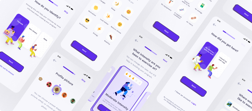
The problem I was solving.
Exercise physiologists prescribe exercise as medicine for people managing chronic conditions. The problem: patients improve in the clinic and regress at home. The intervention worked. The gap between sessions didn't.
EPs had no visibility into what happened between appointments. No signal meant no ability to intervene before a patient churned. By the time the clinician knew there was a problem, the patient had already left.
How I framed it.
I ran structured interviews with exercise physiologists and their patients before figuring out a single brief. Not to validate a solution, but to get to know what was getting in the way of their practice.
Structured interviews
Semi-structured sessions with EPs and patients. I was listening for frustration, workaround behaviour, and the things people said they couldn't do without.
Journey mapping
Mapped the full patient journey from referral to discharge. The gap between sessions was painfully absent in existing tools.
Validate with users
Ran prototype tests at two clinics before build. We were testing comprehension and trust, not just usability - would a patient actually log a session unprompted?
Build and test in cycles
Design Monday. Build Tuesday–Thursday. Ship Friday. EP feedback on Mondays.
What the research told us.
- "Everything takes too long."
- "I spend too long booking and chasing up clients."
- "I'm relying on their memory or truthfulness."
- "I feel really alone post diagnosis."
- "I don't feel like it matters if I actually do my programs."
- "I feel like [the clinician] forgot about me."
The core insight: both sides felt disconnected from each other between sessions. The clinician had no signal. The patient had no accountability. There was no ongoing support, safety, or communication. All things that research dictates is the bare minimum.
What I designed.
Two products sharing one data model. The clinic web app gave EPs a real-time view of patient adherence: who was engaging, who had gone quiet, and who needed an intervention. The patient mobile app made exercise feel like something worth logging.
The centrepiece of the patient app was the Metabometer: a single adherence score that distilled behavioural data into one number a patient could actually care about. It replaced a wall of metrics with something legible and motivating.
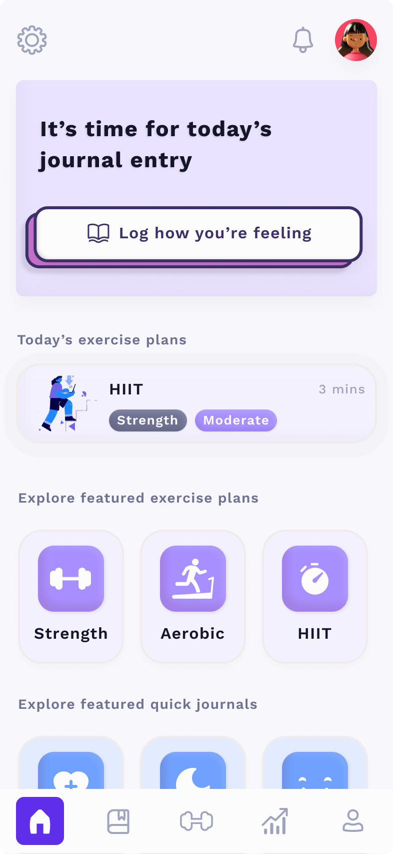
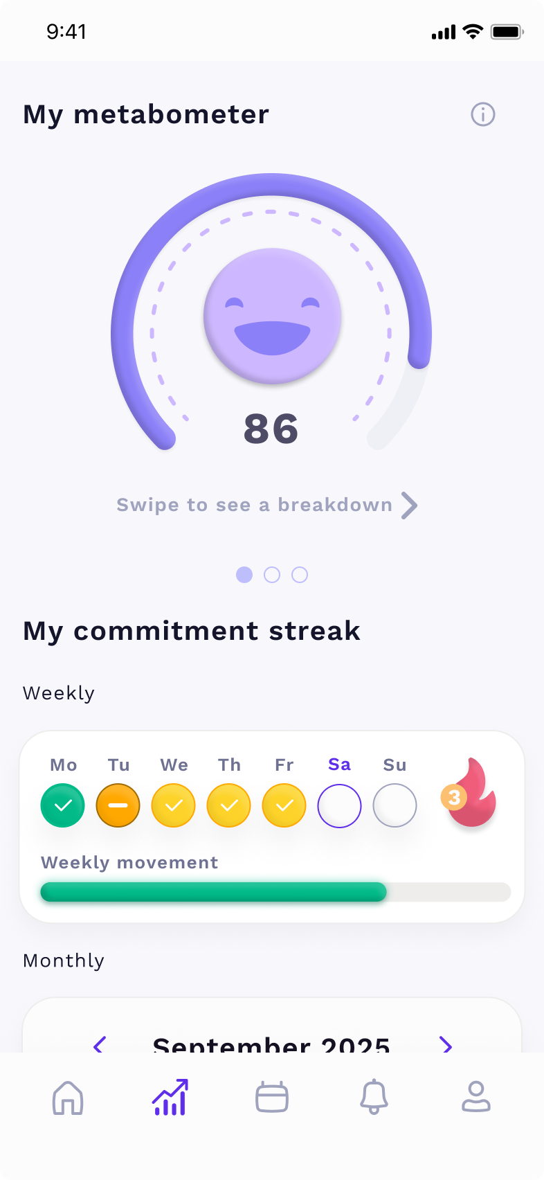
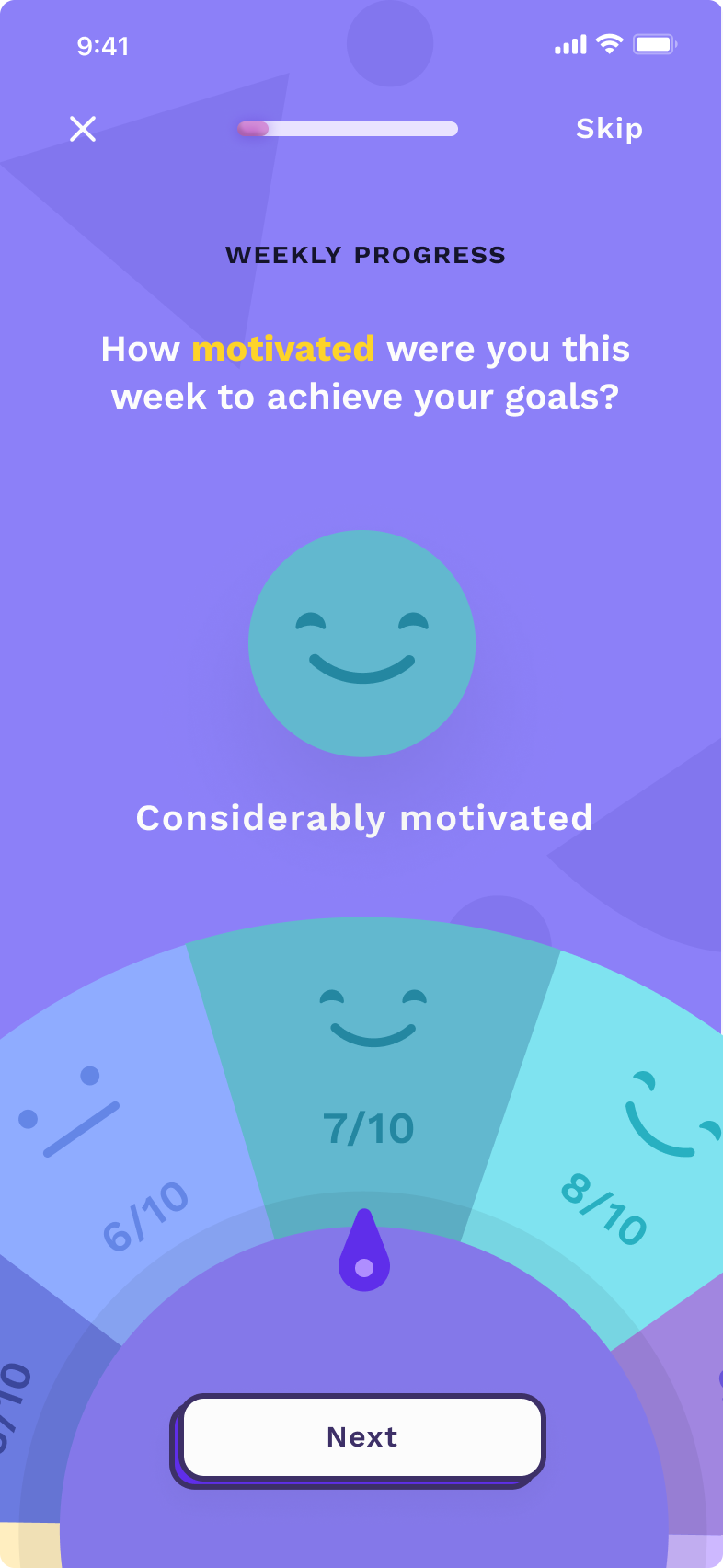
On the clinic side, I designed a client pipeline - a triaged view of which patients were at risk of churning, so EPs could prioritise their outreach without extra admin work.
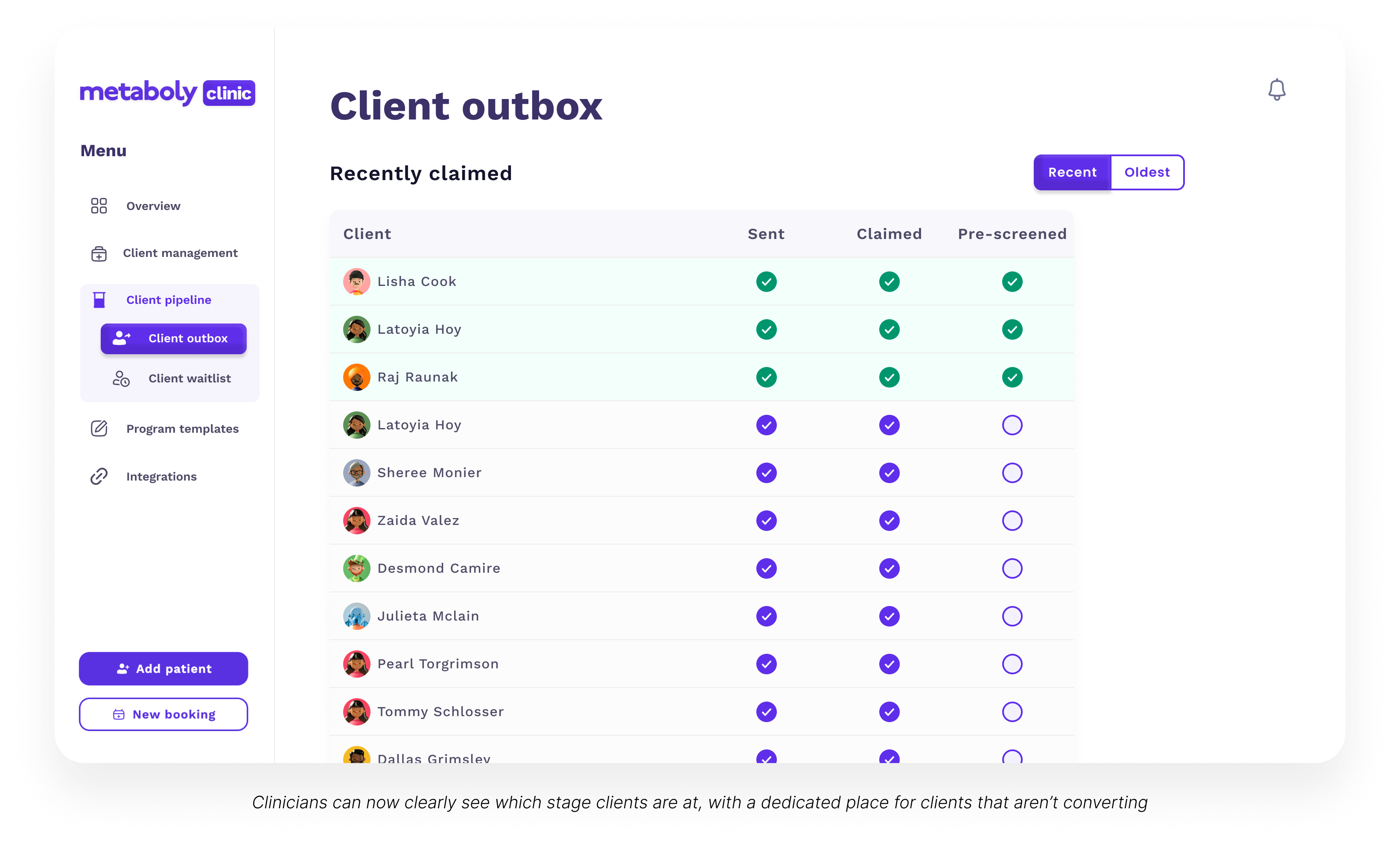
Dead simple, dead effective. Clinicians could now see exactly which stage each client is at, with a dedicated place for clients that aren't converting.
Psst, this is just one page. To view more screens look at the full case study ↗
The design decisions that mattered.
The hardest calls weren't about visuals or flashiness, since the bar was so low for design in the industry. It was more about what to exclude. I removed anything that required the clinician to change their existing workflow: no billing, no patient records, no calendar. Every removed feature increased adoption.
The most counter-intuitive insight: reducing consult frequency from monthly to fortnightly, with a shorter call, improved retention more than any product feature. The product's job was to make those calls valuable, not to replace them.
The outcomes.
What I'd do differently.
I was designing and running research simultaneously from day one, which meant some of my early research was shaped by what I was already building. I'd separate those phases more deliberately. Be more strict with research before touching Figma, not in parallel with it. It seemed like the fastest way to do it and we wee time poor. But it meant much more time was wasted. The pivot came six months in. With cleaner research separation, I think it would have come in three.